
Bookify · EdTech Brand Concept
Bookify
Wisdom for Everyone — a brand and campaign for a book-summary app, designed end to end.
Wisdom for Everyone — a brand and campaign for a book-summary app, designed end to end.
Bookify distils great books into short, digestible reads and listens — so learning fits into a busy life. The promise is democratic: knowledge that has moved humanity forward, made accessible to anyone.

Every leap humanity has made rests on knowledge passed from one mind to the next. Bookify takes that thread and makes it effortless — the essence of a book in the time it takes to have a coffee.
The brand speaks to curious, time-poor young professionals — roughly 25 to 45, gender-neutral, with the disposable income to invest in themselves. People who want to keep learning but rarely finish the book on the nightstand.
The category is real and competitive: Blinkist sits closest, alongside Audible, Kindle, Goodreads and Scribd. Bookify's room to win is tone and craft — a brand that feels less like a productivity tool and more like a modern companion for the intellectually curious.

The identity draws a straight line from the product to the ideas beneath it — ancient philosophy, world culture and the long human habit of sharing knowledge. Every choice, from colour to type, carries a piece of that story.
Two primaries, each chosen for meaning as much as look — a calm, wise green against a warm, historic red-orange.
A brilliant red-orange first made from powdered cinnabar — used in Ancient Rome, illuminated manuscripts, Renaissance painting and Chinese lacquerware. A colour with centuries of cultural weight, and Bookify's voice of energy and confidence. It also earns its place on screen: against the blues and neutrals most apps default to, vermilion is the hue that catches the eye first — which is exactly why it carries the app icon.
Named for the sage — from the Ancient Greek sophós, one who has attained wisdom. A calm, considered green that grounds the brand and signals exactly what Bookify is for: getting wiser. It's also the counterweight to the vermilion: where the red-orange grabs attention, sage evens out the contrast, cools things down and gives the eye somewhere to rest.
A characterful display serif for headlines, a dynamic grotesque for sublines, and a workhorse sans for everything that has to be read on a screen.
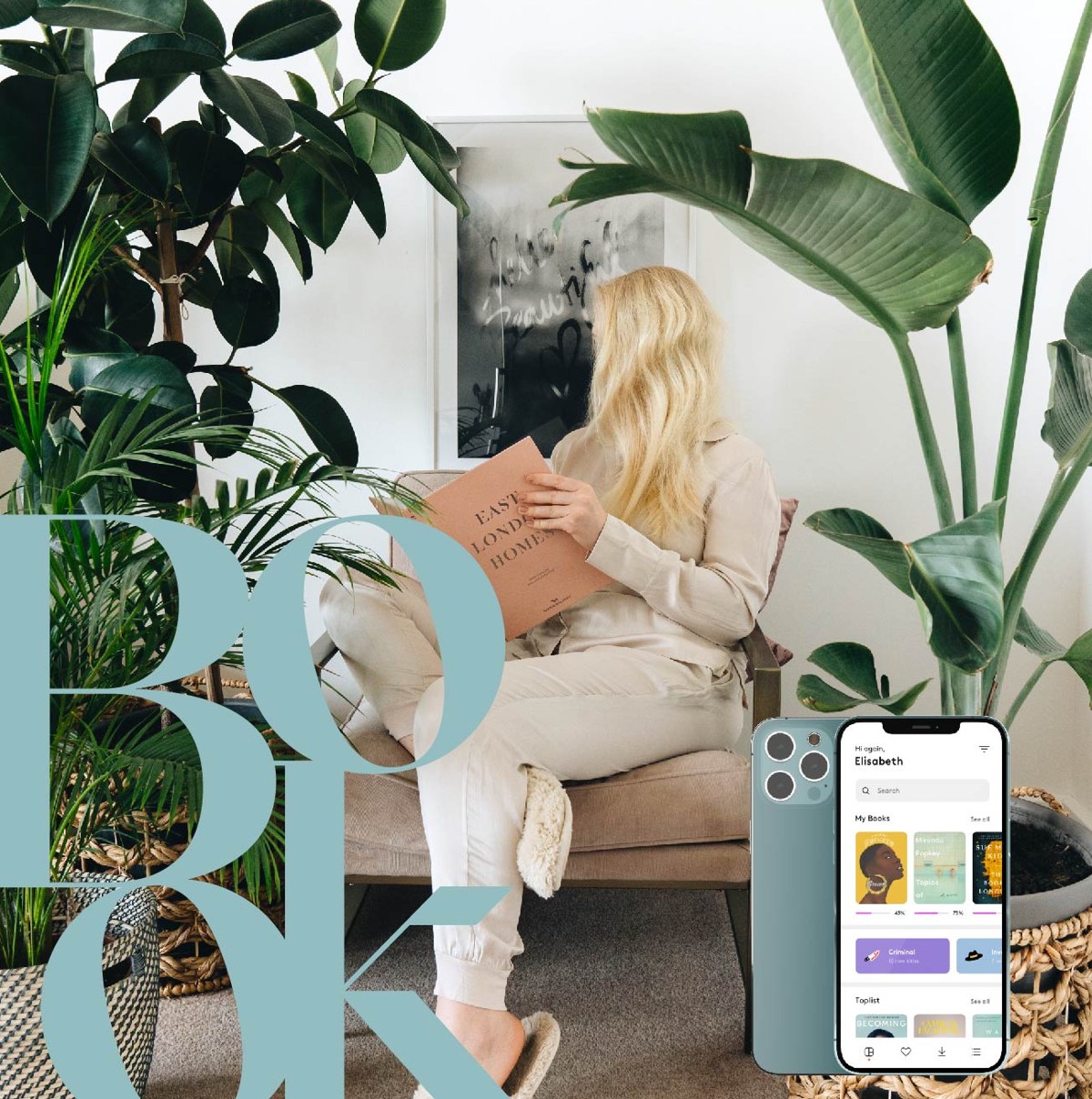
The app icon stacks the word BOOK into a compact serif monogram. It always holds the two primaries but flips freely between them — and can borrow the secondary palette when it needs to.


This is an app icon first. Where most apps reach for a sans-serif mark in blue or neutral tones — the default across Apple, Google and much of the App Store — Bookify does the opposite: a serif monogram in vermilion. On a home screen crowded with familiar, cooler icons, the warm red-orange and the editorial letterforms cut through and pull the eye straight to it.
The image world is built on people and world culture — warm, positive, held in brand colours or grounded neutrals. Diversity is deliberate and visible throughout: from travel and philosophy to the simple act of reading.

The campaign turns on a simple truth: in a feed fixated on how we look, it's the mind that matters — not the face. Who you are doesn't decide what you can learn, so each image hides the face behind a book and lets the idea do the talking.
There's a deliberate tension in it: real, physical books stand in for a product that is entirely digital. Casting is diverse and includes BIPOC representation by design — because the promise only holds if everyone can see themselves in it.
Built as a set of 1080×1080 posts for Instagram and LinkedIn, art-directed in-house and extended through influencer collaborations — where creators start hidden behind a book, then reveal themselves and share what they learned.


The project started the way most of mine do — on paper. I mapped the territory from knowledge and wisdom out to philosophy, communication and sharing, and sketched the “stone age to space age” storyboard that later became the campaign's backbone.

Dozens of iterations across colour and type — testing weights, ligatures and that playful, dropped ify — before the final Bookify logotype settled into place.

Credits. Bookify is an independent brand concept — strategy, identity, art direction and campaign by Sophie Andresen — developed end to end as a complete, usable brand system rather than for a commercial client.
Photography & type. Campaign images shown here use stock photography (Pexels / Unsplash) as placeholders for the art direction; a live rollout would commission original photography to the same brief. Typefaces: SangBleu Empire and NewParis / Panam Skyline by Swiss Typefaces; Inter by Rasmus Andersson.